I’m not sure why every time I convert an image to Lab colour, the opening lyrics from The Monster Mash: “I was working in the lab late one night…” spring to mind; perhaps because of the unearthly possibilities this colour gamut is capable of producing, or perhaps, more likely, because I’m simply weird.
Most are at least passingly familiar with the RGB and Adobe RGB colour spaces (if you’re not, we’ve a terrific primer in issue Volume II), as the former is generally the default on monitors and cameras, while the latter typically requires selecting an option on your body and purchasing a wide gamut monitor in order to realize its full utility. Others may also be used to employing CMYK in their printing endeavours. CMYK makes sense in that its components are the direct opposite of those in RGB. That is, on the colour wheel, cyan is opposite red, magenta to green, and yellow to blue. In print, cyan absorbs red light, magenta green, and so on. RGB uses luminance levels of each colour mixed, while CMYK relies on percentages of ink colours applied.
Lab colour on the other hand, seems to generate some measure of consternation among photographers, leading to a lot of head scratching, shrugging, and ultimately casual dismissal of this extremely useful gamut. So why are folks confused? Well, people understand mixing primary colours to achieve a desired result; painters have been doing this for millennia — so, combining red green and blue (RGB) makes sense. However, Lab works a little differently. We’re still combining three things, but in a different manner. Let’s first examine what the acronym Lab stands for: Lightness, A, and B channels.
Well the first one makes some sense, but what are these two arbitrarily named channels, and how do they all work together? The easiest way to understand A and B is to relate them to something you’re probably more familiar with: Tint and Temperature respectively. ‘A’ channel represents a range of colours from green through magenta; while ‘B’ includes values spanning blue through yellow. Numerical values for these go from negative 128 through positive 127, with zero as a midpoint. Green and blue are on the negative side, while magenta and yellow are on the positive. Take a look at these sliders in Lightroom or similar and you’ll see the similarity, though the Temperature adjustment is calibrated in degrees Kelvin instead.
Lightness on the other hand works a little differently than one might expect in that it actually affects the rendered colour much the same as the other two components, and can best be thought of as being responsible for what shade of a particular colour is selected by mixing the other two channels’ results. Its values range from zero through one hundred, with zero representing black, and one hundred, diffuse white.
What’s it Good For?
Ok, fine… why do I care? Well, for starters, Lab colour is huge in terms of the size of its gamut; and is indeed the largest available to us when working with our images in Photoshop. This means that we have access to the entire range of colours that the human eye is capable of perceiving — and beyond (imaginary colours, outside the scope of this article). Lab has been designed to closely mimic human perception of colour and differs from the RGB model in that the range of reds greens and blues that we see in nature benefits from their inclusion within this wider palette, while the span between, let’s say cobalt and lavender (not official colour designations, but close enough) on the colour wheel gets compressed. Therefore, you are more able to accurately colour match your output to your original perception when you released the shutter.
Developed in 1976 (well, rather refined from a 1931 model), Lab is also designed to be device independent. That means there are no profiles to concern yourself with (beyond standard CIELAB D50 you’ll find in Photoshop etc)… Lab is Lab. So, for example when you convert to CMYK for printing, your image won’t undergo significant colour shifts which you might otherwise encounter when converting from RGB or sRGB. This is a huge time saver and one of the reasons why many professionals prefer to work in Lab.
Sounds Good, What Else?
While the above is great, let’s get into some practical examples of things you can do with Lab. First of all, one of the primary advantages of Lab for photographers is the ability to perform sharpening activities without the noise and artifacts normally associated with undertaking the same actions in other colour spaces. As a result, you can take your sharpening pretty far indeed, without having to worry about unintended consequences (beyond producing an over-sharpened image from a taste perspective). There are several ways to approach this task in Lab but we’ll cover the easiest, and then a more flexible and non-destructive solution. We’ll be working in Photoshop, so if you’re using another image editor (Gimp etc.), you’ll have to accept our apologies and transpose our methods to your favourite application for yourself.
Once you’ve opened your image in Photoshop, convert it to Lab by selecting Image > Mode > Lab Colour. Easy peasy. Now duplicate the background layer by using your preferred method (right click on the layer and select duplicate, drag the layer down to the new layer icon, etc.). Next you’ll want to select the Channels tab and highlight the Lightness layer. From the Filters menu, select your desired sharpening option and apply it in whatever amount you would normally be comfortable with. Click on the composite Lab channel (the combination of all three channels) and see your results. Now hit ctrl/cmd-z to undo that and try sharpening it again, but this time around, try seeing just how far you can push things without causing noise and artifacts… pretty cool, right?
Ok, well that worked pretty well, but for a more refined approach, let’s take advantage of the non-destructive power inherent in Photoshop’s smart objects and filters. First select the layer you wish to sharpen and then ‘Convert for Smart Filters’ under the ‘Filters’ menu. Now we’ll add a smart filter to the layer: Smart Sharpen (Filters > Sharpen > Smart Sharpen). If you haven’t used Smart Sharpen before, and perhaps are used to employing Unsharp Mask instead, you’ll notice a lot of options that may be unfamiliar to you. However, once you become accustomed to using it, you’ll realize the flexibility and power that comes with its utilization is well worth the effort in learning something new. Apply your sharpening settings and wait for the filter to do its magic. Now, in order to duplicate the effect achieved in sharpening only the Lightness layer, select the Blending Options icon located in the lower right hand corner of the filter layer. Now choose ‘Luminosity’ from the drop down menu, and voila, you’ve replicated the effect of sharpening only the Lightness layer; however, you have the added bonus of being able to go back and edit your sharpening settings and opacity… all non-destructively. Magic.
Presence
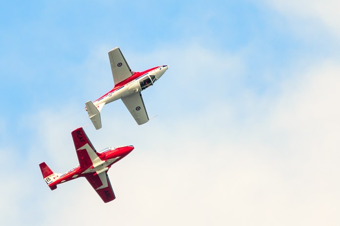
This next technique will really help increase your contrast and make your colours pop! For this example I’m going to use this image of two members from the Snowbirds aerial acrobatic team, taken on their recent visit to Nanaimo. For this shot I was using the only long lens I had available to me at the time (don’t ask): the Sigma 50-500mm f/4-6.3 @ 500mm. While the lens definitely sports an impressive focal length, that’s really all it’s got going for it. Contrast, detail, and sharpness are not among its best features… and frankly it might more appropriately be named “The Black Hole” considering the substantial light it requires to achieve blur-free photos at 500mm. That said, while I might not be shooting hole-in-ones with this lens, at least, under ideal circumstances, it can get me on the green generally.
Even after initial work undertaken in Lightroom, the colours don’t really pop and the contrast leaves something to be desired. So how best to address this? After converting the image to Lab as above, we are going to add a ‘Levels’ adjustment layer to your duplicated background. (N.B. you can also get more precise control over this technique using curves, but we’ll leave that for your own experimentation). The first thing you’ll notice that’s different from working in RGB, is that you are not able to work on the master, but are forced to make your levels adjustments to the individual channels… trust us, this is a good thing!
First we’ll bring up the contrast by selecting the Lightness channel and dragging the black point and white points nearer the respective edges of the histogram data. Next, we are going to switch to the ‘a’ channel. Here we’re going to punch things up moving the black and white point values equal distances from their current position. Notice, that although we are indeed in Lab, and channel values are supposed to be from negative 128 through positive 127, here in the Levels adjustment layer, they are represented as being from 0-255. That’s ok. Let’s move the sliders up and down 40 respectively by clicking inside the numerical display and hitting shift-up arrow four times for the black point, and shift-down arrow four times for the white. We’ll leave the centre or gamma slider where it is. Ok so now the values are 40 and 215 for each.
Wow… the colour has gone screwy! That’s ok, repeat the process exactly (assuming the colour balance is correct in the first place) in the ‘b’ channel and we’re golden. Look at the difference! Of course it’s easy to see how we could also correct colour casts in our photographs at the same time as we tweak punch… all using a single adjustment layer. Amazing!
Just the Beginning
Of course we’ve merely scratched the surface of all the cool things you can do with this incredibly versatile colour space. We’ll certainly be including more techniques in future issues, so stay tuned! As always, don’t be afraid to experiment; you’ll be surprised at the beautiful — and sometimes crazy — results that are possible in the Lab.