As we discussed in our feature article on colour management, correct calibration of your gear will not only save you money on wasted ink and paper, but considerable sums in Aspirin expenditure as your headaches related to producing colour-accurate images across mediums will be significantly lessened.
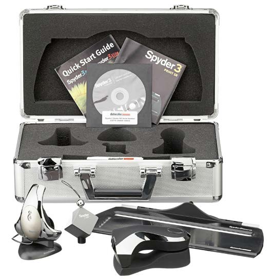
Now, while most colour calibration kits are solely aimed at the monitor, Datacolor has closed the loop by including both an excellent colorimeter to ensure accuracy on your display, and spectrophotometer which profiles your printer’s output in their Spyder3Studio SR package. The combined effect of having both profiles certainly results in much better colour fidelity through the entire creative process — ensuring your desired output is realized on-screen and in print.
The company was kind enough to ship us a unit to evaluate for the magazine, and we were determined to put it through its paces to see how it stacked up against other packages we have tried in past. Upon receipt, our immediate reaction was one of surprise — the packaging was both excellent and unexpected. Arriving in a tough silver metal flight case, the interior is soft foam which does an excellent job of protecting the components housed within. However, as you can’t judge a book by its cover, we decided to dive right in and see how it fared in the real world.
The quick start manual suggested we calibrate our monitor first; so we selected a full spectrum 30″ Dell running at 2560×1600 for the evaluation. Additionally, they recommend that your display has been powered up for at least 30 minutes without going into power save mode… which is never a problem around here.
As we mentioned in the Show Your True Colours article, when calibrating your equipment, you want to be in a room where lighting conditions are both constant and comfortable… this means either no windows, or you work at night. Personally, as my office overlooks the ocean and mountains I choose to do all my processing in the evenings. I know — life is cruel sometimes!
On With the Show
So into the DVD drive went the software, and after the usual warnings from Windows 7, we were presented with a menu whereupon it became apparent that there were two separate installation programs: one for each device. Not a big deal we figured — though a serial install in one process would seem to make more sense. What was a big deal is that the installer, without asking our permission, immediately deposited two icons on our desktop, which frankly are about as welcome there as the variety of deposits dogs leave upon your lawn. Sorry — it’s a big pet peeve. Among unwelcome desktop icons, start menu cruft, quick start icons, unnecessary task tray items, ‘helper’ startup tasks, and software that doesn’t really uninstall when you request its removal, our irritation is pretty evenly split. I don’t know; perhaps we drink too much coffee.
Anyway, those were quickly dispensed with and we plugged the Spyder 3 Elite into the USB port for its first trial run. The Quick Start manual instructed us to now ‘Launch the Spyder 3 software and follow the instructions’. Ok, great. There were two icons on my desktop which were labeled Spyder 3, and three programs in my start menu with the same naming convention. Oh well, we figured we’d just select the first one of the icons that it had installed (and we had subsequently deleted) from our desktop: Spyder 3 Studio SR. That seemed to do the trick as we were now presented with a menu asking us whether we wanted to calibrate our monitor, printer, or to learn how to use the handy Spyder Cube that ships with the kit — more on that later.
The software asks what kind of controls are available to you to adjust the settings on your display, and then makes recommendations as to what profile you should calibrate for. You may override the defaults if you wish; however we decided to just go with them to see what kind of job it would do. Our Dell monitor unfortunately has one of the worst on screen menu systems we have ever seen — and while there are several presets which obviously correspond to a specific colour temperature, we have no idea what those were as they were identified by such meaningless names as Desktop, Multimedia, Game, Warm, Cool, etc. As a result, we were forced to adjust the RGB sliders manually which is a bit of a tedious affair, though ultimately can provide the most accurate settings.
After running the calibration at a default setting of 6500 kelvin, things did indeed look better, but still not quite right. We decided to do the calibration again, this time selecting the option to measure the ambient light of the room and take that into account. The software now suggested we use 5800 as a colour temperature target; and going through a slightly more involved ordeal than the default, resulted in considerably better accuracy.
At the end of the process, the application shows you a series of photographs which you may view in before and after calibration modes so you can immediately discern the difference — very handy to ensure things are looking their best.
Print Perfection
Now for the next stage: printer calibration. When you make this selection in the Studio software, the menu changes to give you the option of learning about colour management, or forging ahead with the calibration process. We highly recommend you read the tutorial first, as it will give you invaluable instructions including such things as turning off all colour management before you print your test targets… though for some this may prove hard to do as they may be unfamiliar with the arcane details of their particular printer driver.
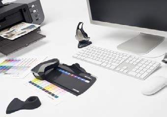
Speaking of test targets, this is the first thing done when proceeding down the calibration path. You identify the characteristics of your printer to the software, then select from several target options which print anywhere from 2 to 9 pages of colour swatches for you to subsequently measure with your new meter. We accepted the software’s recommendation and printed the EZ High Quality Target which contained 225 swatches on two pages.
After allowing at least a half an hour to dry, the application asks you to place the unit in its base to measure the white point, then you click the button and swipe the unit across each row of swatches, listening for the audible click which informs you that you may move on to the next. At the end of each row there’s a bell sound that lets you know everything went ok and telling you to proceed to the next. The entire process took about 3 minutes, and again at the end, we were presented with the same series of images you could now print and compare to their on-screen versions. We went ahead and did this, finding the colour pretty much exactly how we expected it: perfect.
Totally Cubular!
Finally the package comes with a great little gadget to help you nail white balance and exposure in all your post processing endeavours. It’s a little cube that features neutral grey, true black, and white surfaces, as well as a small chrome sphere on top to assist in measuring highlights. All you do is shoot the cube in the same scene with your subject in one image, then use that as a reference for proper white balance as well as white and black points for exposure in the rest. What could be easier? Just a few clicks in Photoshop and everything looks just like it should — no fuss, no muss.
Conclusion
Aside from some minor consternation and irritation in the software installation process, we are extremely pleased with Datacolor’s Spyder3Studio SR results; and that’s what really counts. The units are well designed, packaged, and just work. You won’t regret picking one up for around $400 USD, and over time it will pay for itself in saved consumables, and fewer stress days!