Once upon a time, you blew through a roll of 24 or 36 exposures, dropped it off at the lab, and anxiously awaited the prints — never being really certain of what the results would be. Did you blow the focus… nail the exposure… did the subject blink? Not only did you harbour these concerns, but were also subject to the application of talents (or lack thereof) the lab technician brought to bear on your work — potentially converting your masterpiece into a holiday snap.
Of course, photographers were free to undertake darkroom duties themselves, and certainly many, if not most of the pros did; however, the alchemy involved was often beyond the ken of the aspiring shutterbug, and lack of facilities was also all too often a barrier. So, for most, photographers were stuck with what they got, for good or ill.
Today the situation is far better: not only are you able to instantly determine whether you’ve captured what you’d envisioned, but increasingly, photographers are personally embracing the entire process, from releasing the shutter, through producing the print — and relishing in the complete control afforded them in so doing. Unfortunately, while the current state of affairs as applies to the photographic chain is infinitely better than in years past; it certainly isn’t without its own challenges and pitfalls.
The Digital Dilemma
Given the inherent complexity in mastering the capture side of the photographic equation, you might forgive those who believe that producing a print which matches what they’ve viewed on their camera’s LCD should be as easy as clicking the correspondingly labelled button on their computer. After all, everything’s digital right? Shouldn’t the integrity of what’s passed through the chain be preserved from LCD to print? Not quite.
As anyone who has undertaken to complete the chain themselves has witnessed, photographs can appear quite different through every step of the process: the image rendered on the camera LCD diverges from that displayed on the monitor, and further still from what is ultimately recorded in print. Often the final product bears little resemblance to that which the photographer believed they had captured. Why is this?
Nature of the Beast
The primary issue responsible for the above is the fact that different devices possess substantially disparate display characteristics. Camera LCDs are designed to be viewed in full sunlight; and as a result, are often far brighter than their computer display counterparts. This typically leads to situations wherein, the photographer, upon viewing the result of a shutter actuation, may erroneously determine an image looks great, when in fact, it is substantially underexposed. Of course, this situation may be rectified by careful attention to the histogram [for a complete discussion on using your camera’s histogram, see our last issue!], but this difficulty represents only one of many gotchas potentially experienced as you tread the path from click to canvas.
Further, the way an image is rendered on a display is different from the way your eye perceives that which is laid down on paper. The former emits photons directly; while the latter depends on reflected light to cast an image upon our retinas, and this is substantially altered depending on the substrate utilized for this purpose. That is, whether you are using matte or glossy, canvas or metallic… whatever paper you elect to print on will have its own reflective properties and affect the appearance of any image printed upon it.
But wait — there’s more! Not only do display qualities and medium characteristics interfere with maintaining image fidelity throughout the process, but differences in colour gamut between devices are frequently to blame for inconsistencies realized in the final product. So while you may be shooting in one colour space, say Adobe RGB, you may be (quite often actually) viewing the image in another, typically sRGB [for a full discussion on colour spaces, see issue Volume 2]. Is it any wonder then that your end result often diverges from what your perception of the initial capture might be?
So What to Do?
How you circumvent these difficulties involves making decisions and undertaking actions in every step of the process… from camera, through computer, to print. As mentioned above, the image displayed upon reviewing in your camera’s LCD should only be used as a rough guide; and the histogram should be utilized in support of evaluating exposure. Use the preview image to determine framing, and zoom in to your focal point at 100% to gauge whether you’ve nailed your focus. Don’t use in-camera effects or sharpening, and use RAW instead of JPG, as this format enables significantly more latitude for colour correction etc. in post. Additionally, you’ll want to employ the widest colour gamut available on your camera — typically Adobe RGB — to ensure you are capturing the full range of the tones in the scene that your camera is able to process.
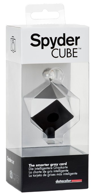
Fine tune your white balance on your computer — having done the best you can to achieve accuracy in capture. When you use RAW, white balance is easily adjusted in Lightroom or whichever RAW editor you choose, and has no ill-effects whatsoever on the finished product. Fortunately, these days, automatic white balance settings are so accurate, many photographers pay little attention to it until they actually view the image on their PC. However, to achieve the best results, take a white balance calibration shot using a grey card or similar (WhiBal, Spyder Cube etc.) and you’ll be assured of consistency in your images.
Ensure your monitor has been correctly colour calibrated using one of the many excellent hardware solutions available [see our review of the Spyder 3 Studio SR], and always process your images in an environment which has consistent lighting. Often this involves doing your digital development work at night, as this generally assures a constant level of illumination. You must also remember to recalibrate your monitor on a regular basis, as these devices tend to experience drift and will fail to remain colour accurate over the long term. If you are able, (and this is becoming an increasingly affordable option), use a monitor that displays a wide gamut to present a true representation of your photograph on the screen. As you generally want to shoot using Adobe RGB, you will find that many monitors are incapable of rendering the range of tones captured within that gamut. Almost all consumer level displays utilize the sRGB colour space, and you’ll find this will often produce unexpected results when hitting the print button.
On the printing side of the process, there a number of things to bear in mind before committing ink to substrate… foremost among them, which printer to have purchased in the first place. If possible, you’ll want to buy a unit that also supports a wide gamut — either Adobe RGB or ProPhoto. Many manufacturers offer models that include this functionality; however, don’t expect to find it in those at the lower end of the price scale. Further, ensure the printer you select has custom profiles available for a wide variety of printing surfaces. These profiles are imported into your computer and are user-selected thereafter in your application upon electing to print, according to what type of paper you are using. Choosing the right profile for the substrate ensures the best possible result in maintaining colour fidelity.
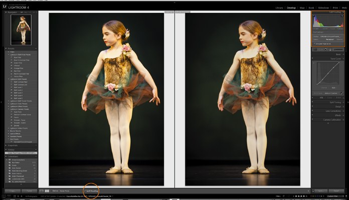
Finally, you’ll want to ‘soft proof’ your image in advance of hitting that print button. Soft proofing in an application such as Adobe Photoshop or Lightroom (4 and above) allows the photographer to see any parts of the image that are ‘out of gamut’, so that you may make a decision to either adjust accordingly, should these areas fall within important sections of the image, or just live with the result. When you’re satisfied with the result, it’s time to click that print button; but here’s a couple of tips to bear in mind in so doing…
Make certain you are only managing colour in one place. That is, don’t have both the printer driver and the application you are printing from fighting over colour management, as this will lead to very sketchy results indeed! You’ll typically want to let your editor take on these duties, be it Lightroom, Photoshop, Aperture, or whatever. Additionally, print a test image at 4×6 or similar before committing to ink and paper expenditure on a larger scale. This will save you significant headaches and money, as even if you adhere to the above faithfully, no process is perfect, and your initial result might require some tweaking in advance of pulling the trigger on that wall-hanger. Nothing is worse than blowing a ton of ink and wasting expensive substrate; so do a test — your pocketbook and therapist will thank you.
Having complete control over the photographic chain is at times both frustrating and challenging; however, the rewards conferred upon the photographer far outweigh any potential negative experiences. So, dive right in… your next masterpiece awaits!