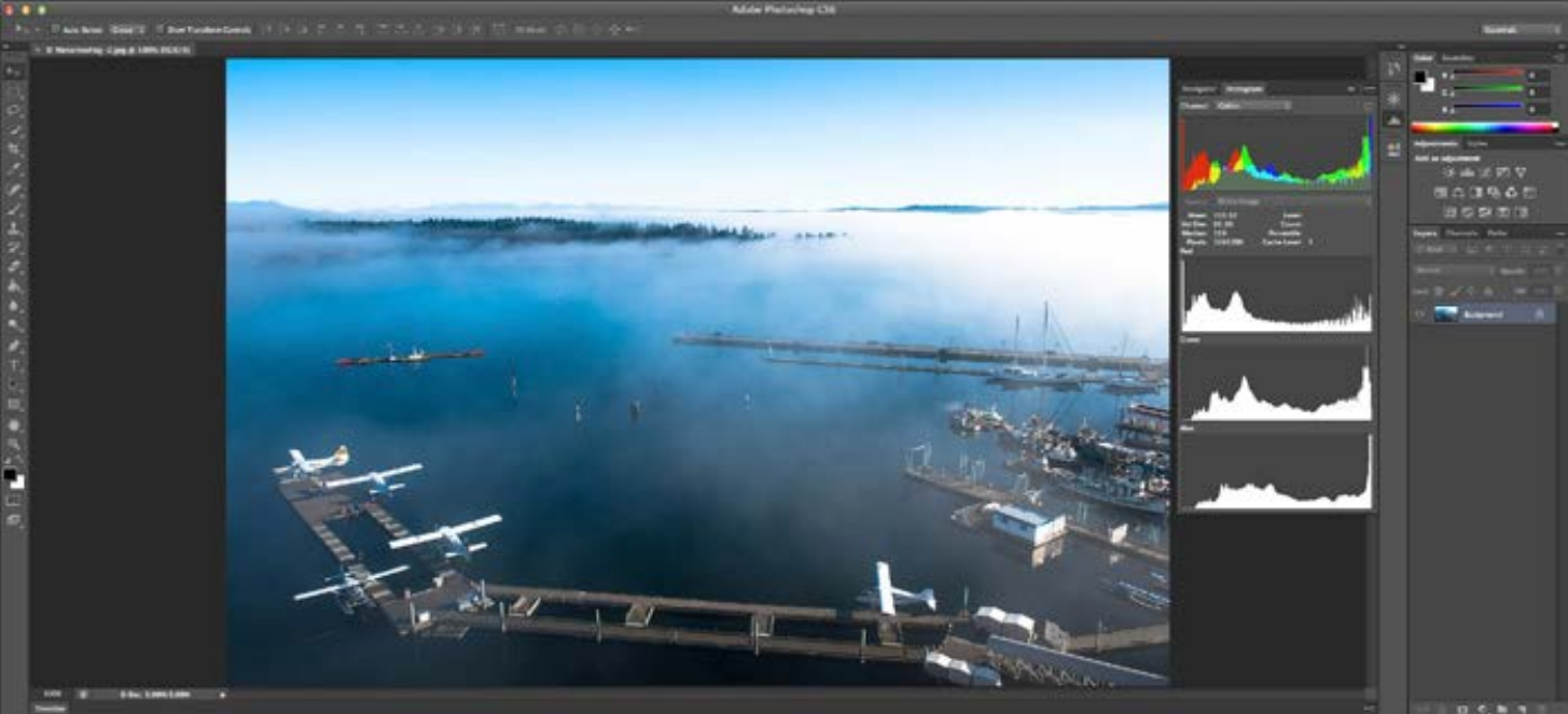
One of the most useful, yet least understood features of your digital camera has got to be the histogram. That daunting looking bar graph, or series of charts in the case of channel-specific histograms, has baffled more than a few upon first encounter. So what’s it all about?
It’s Simple.
First off, all your histogram does is measure the number of pixels at a specific level of luminosity within your image. That’s it. The x axis (or horizontal scale) represents the luminosity level ranging from 0-255, while the y axis (or vertical) measures the relative number of pixels at that particular luminosity. Values at left along the x axis are dark and move right to bright. So if you have a lot of amplitude at the right side of your histogram (represented by a hump in the graph) your image will contain a lot of bright values; while if your image has a lot more amplitude on the left, it will typically be darker.
Yes, we know this term isn’t entirely scientifically accurate, but we’re talking within the context of digital imaging parlance here, and if it’s good enough for Adobe Photoshop, it’s good enough for us.
Your camera may have a combined RGB histogram which is less precise about where clipping (channel information loss due to under or overexposure) is occurring, given it adds the individual channel histograms together and discards colour information — presenting one unified graph; or you may have a histogram of each channel which provides for a more accurate representation. Ideally, you’ll have both.
Well that’s Exciting… What’s it Good For?
Most folks will tell you, the histogram’s only use is providing very rudimentary information on your exposure. If you have a spike at the extreme of either end, it’s an indication that you’ve blown out your highlights or shadows and may wish to adjust your exposure. These same folks will tell you they almost never look at the histogram, as they use ‘blinkies’ (the option which causes overexposed highlights to blink on and off when viewing an image) to inform them of overexposure, and the image display itself to judge exposure in general.
What happens however, when you’re outdoors in bright sunlight? Can you accurately assess exposure based on the barely visible LCD screen? The display is actually a pretty lousy way to judge whether you’ve nailed your exposure or not under the best of conditions. How many times have you viewed an image on the back panel which looked great, only to find it was less than optimal when you downloaded it to your computer for processing? We find the photo review function good for examining composition details, and that’s about it.
Histograms, on the other hand, provide information on your image which is accurate under all viewing conditions. The trick is knowing what you’re looking at, and what to do with it.
First off, as mentioned above, the histogram can certainly inform you as to whether you’ve blown out your highlights or shadows, but channel-specific ones also let you know where that clipping is occurring. This enables you to make a decision on whether that is important given the context of your image. Sometimes you may decide that having one channel slightly blown will yield a better image overall as it may push another channel further to the right which allows for more information being captured within it. Generally, this isn’t the case, as you don’t want to lose any information in your image; however, having this knowledge empowers the photographer in a way that ‘blinkies’ simply do not.
The above example also points to another important fact about digital photography which may only be fully taken advantage of by utilization of the histogram: your camera’s sensor records more information at the higher end of the luminosity scale. Nikon’s sensors for example, typically record 75% of their available data points in the range between luminosity values at the midpoint of 128, and the top of the range at 255. This leads many a savvy shooter to expose their images with a bias towards the higher end of the histogram range in order to maximize preserved details, with a mind to balance exposure out in post.
Learning Luminosity
One further advantage of the histogram is that it actually allows you, with time and practice, to accurately judge exposure. Many people poo-poo this idea; however, they generally aren’t aware of the prerequisite skills needed to be able to pull it off.
In order to use a histogram to gauge exposure, you first need to be able to look at a scene with your eyes and judge the dominant luminosity values. Then, after shooting that same scene, look at the histogram to see if you notice the preponderance of pixels around that value. If so, you nailed it. If not, adjust. This takes less practice than you might think. We actually built a luminosity game that we’ll be releasing for iPhone shortly in order to test ourselves. People improved quite rapidly, and within a week or so, were able to thereafter apply what they learned to their photography.
One proponent of this technique is world class photographer and instructor Ron Reznick. His ‘SureShot System’ of instructional videos strongly advocates careful use of the histogram, and learning how to manually evaluate luminosity values.
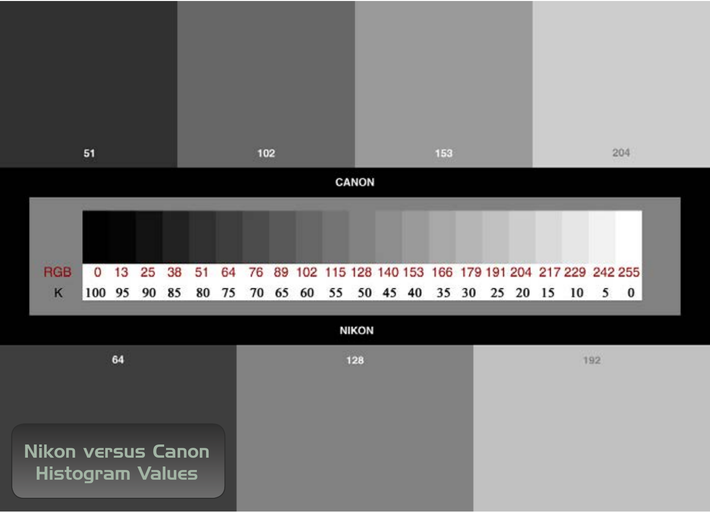
Histogram Differences
While the principles behind histograms are essentially the same, different camera manufacturers display their information in a variety of ways. Nikon for example utilizes the most common histogram format which divides the chart up into four segments with the line in the centre representing the midpoint of luminosity of 128. Values at each line are 0, 64, 128, 192, and 255, which makes a lot of sense. This format is also used by Adobe in its Photoshop line of products.
Canon on the other hand employs a 5 segment histogram with the lines representing the somewhat strange values of 0, 51, 102, 153, 204, 255. Canon’s design obviously gives you more reference points, but we generally prefer Nikon’s due to its format being duplicated in Photoshop.
Final Thoughts
Well, hopefully the histogram is a little less of a mystery to you now and won’t inspire fear or consternation when it makes its appearance on your display. Perhaps you’ll become a convert like me and select a default photo review mode containing a small image of the shot, accompanied by both a combined RGB, and separate channel-specific histograms in the same view. It certainly serves me well. If you have any questions or thoughts on the above, please feel free to submit your comments to editor@darkroom.pro. We’d love to hear from you!