
There’s nothing more frustrating for a photographer than seeing one image on the back of their camera, yet another version of it in their photo editing software, still another on the web, and yet one more when printed… in terms of colour fidelity. Not only that, but every computer screen the image is viewed on looks different too! Most folks feel that what you see on your camera’s LCD should be ultimately what you get on whatever medium you choose to view it on; unfortunately this is never going to be the case. You can however get close; and hopefully this article will assist you in that endeavour.
Why the Difference?
There are several reasons why colour consistency is so difficult to attain across mediums; however, the primary cause is something called ‘gamut’. Colour gamut is simply the spectrum of colours available within a certain colour space. You can think of it as an artist’s palette… all the colours at your disposal within a confined area.
The colour continuity problem most often arises when an attempt is made to display or print images shot in one colour space on a device or within software that is designed (or has been configured for) another. Individual gamuts contain different colour sets, and there are many standard ones that photographers will deal with on a regular basis.
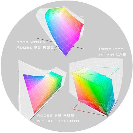
sRGB is probably the most common among the various colour spaces you’ll encounter in your photographic pursuits. It’s the gamut generally used on your monitor, what the Internet is built on, and what many cameras and printers utilize by default. It’s a good utilitarian colour space, but its colours are packed into a narrow area of the visible spectrum, which means the colours it can reproduce do not contain all those we can see.
As you can see by the diagrams, there are several colour spaces whose area is larger than that of sRGB; with Adobe 98 next largest, ProPhoto developed by Kodak significantly larger, and the LAB colour space representing the full range of human-visible spectrum. Unfortunately this difference in coverage often leads to the misconception that there are actually more colours within the wider spaces. This is not the case. There are exactly the same number of colours in sRGB, as in Adobe 98 for example — the difference lies in how widely they are spaced. As you can see, the latter gamut from Adobe includes more saturated colours, particularly in the greens, yellows and blues; which of course allows for closer approximation of what your eye sees through the lens.
While in an 8 bit editing scenario, the number of colours in each gamut is 16.7 million. This can potentially (very seldom) cause problems for example with the wider spacing inherent in Adobe 98 — including banding and colour artifacts — however, when you start working in a 16 bit space, you’ve now access to over 281 trillion colours… and these issues evaporate as the space between colours is so minute.
The Medium Is The Message
Though I’m sure Marshall McLuhan wasn’t thinking of colour fidelity, his famous quote certainly applies, as another potential cause of colour mismatch is the medium upon which your image is being displayed.
Colours presented on a backlit LCD screen for example are capable of being more saturated than those viewed in print, where what is seen depends on the reflected light of the environment. Additionally, different print substrates (whatever you are printing on) all exhibit varied colour characteristics depending on their nature; e.g. glossy, matte, lustre etc.
Fortunately, manufacturers have taken this nightmare of differences into account, and now generally produce colour profiles for their products which you may utilize to obtain the best results when moving from one medium to another. These are distributed in the form of files called ‘ICC’ profiles, which are generated based on standards derived by the International Color Consortium. What these do is allow colour aware applications to use interpolation to map one profile to its closest value on the target device, be it a monitor, printer, or whatever. The method by which they map this is by way of what’s called ‘rendering intent’, with perceptual and relative being the ones more commonly seen in photographic circles — perceptual being the favoured between them as it generally produces the most pleasing images.
Well That Was Very Confusing.
So by now you’re probably scratching your head wondering how you can take advantage of all of the above to ensure the best possible results in your images. Well, you’re in luck. What we’re going to do now is go over 10 easy, practical steps you can use to keep your photos looking the way you intended!
1. Start in your camera. Set it for the widest colour space (generally Adobe RGB), and the highest bit depth available to it. That way, you are capturing as much information as your sensor is capable of recording, and not clipping out more saturated colours which are unavailable to the sRGB gamut your camera has generally been set to by default. Also, ensure you are always shooting in RAW mode in order to maximize data capture and provide as much latitude in exposure and white balance as possible in post.
2. When importing your images into your favourite processor, select either Adobe 98 or ProPhoto as the target colour space. Adobe Lightroom and Photoshop for example use the ProPhoto space for their RAW converter by default. This is a good thing.
3. When printing, ensure you use the printer manufacturer’s ICC profile for the paper you are printing on (assuming they are available). You can generally download these from the manufacturer’s website and easily install on your computer.
4. If you select an ICC profile to use when printing, be certain that you also choose to have the software control colour management instead of the printer. Then disable any colour management done by your printer driver by selecting ‘ICC’ and ‘no colour management’. Having two conflicting applications trying to render correct colours is not going to produce good results.
5. Calibrate your monitor! While your monitor may ship with a generic ICC profile, this is no substitute for a custom one created via a hardware based calibrator. While there are many calibrators to choose from, we review the Spyder 3 Studio SR package within this issue. It is an excellent choice for discerning photographers who want to get things exactly right — every time.
6. One more point on calibration: it won’t do you any good if your editing environment has variable lighting conditions. Ideally, you want to maintain the exact lighting in your editing studio every time you use it. This means either do all your processing work at night under artificial lighting, or work in a room with no windows. While this may not sound pleasant, neither does wasting ink and paper… or sending incorrect images to your clients!
7. When working in Photoshop, you may do what’s called ‘soft proofing’ by selecting ‘Proof Setup’ from the ‘View’ menu. Select the ICC profile of the device you wish to output to and ensure ‘Proof Colors’ and ‘Gamut Warning’ are ticked. This will show you what your image will look like on the target device and will highlight any colours that are ‘out-of-gamut’, which you may wish to adjust.
8. Print small first! Nothing is more infuriating than wasting an expensive large substrate by rendering colours other than how you would wish to see them. If you run a 4×6″ proof at the outset, you’ll save yourself both headaches and money.
9. Recalibrate your monitor often… about once a week. Maintaining accurate calibration unfortunately isn’t a set it and forget it type of affair.
10. Don’t sweat the inevitable discrepancies. Yes, there are going to be small differences, despite all your best efforts, in terms of colour fidelity across mediums. Learn to live with tiny imperfections and you’ll be a happier photographer! Chances are you’re the only one who is going to notice.